Lettering

Lettering
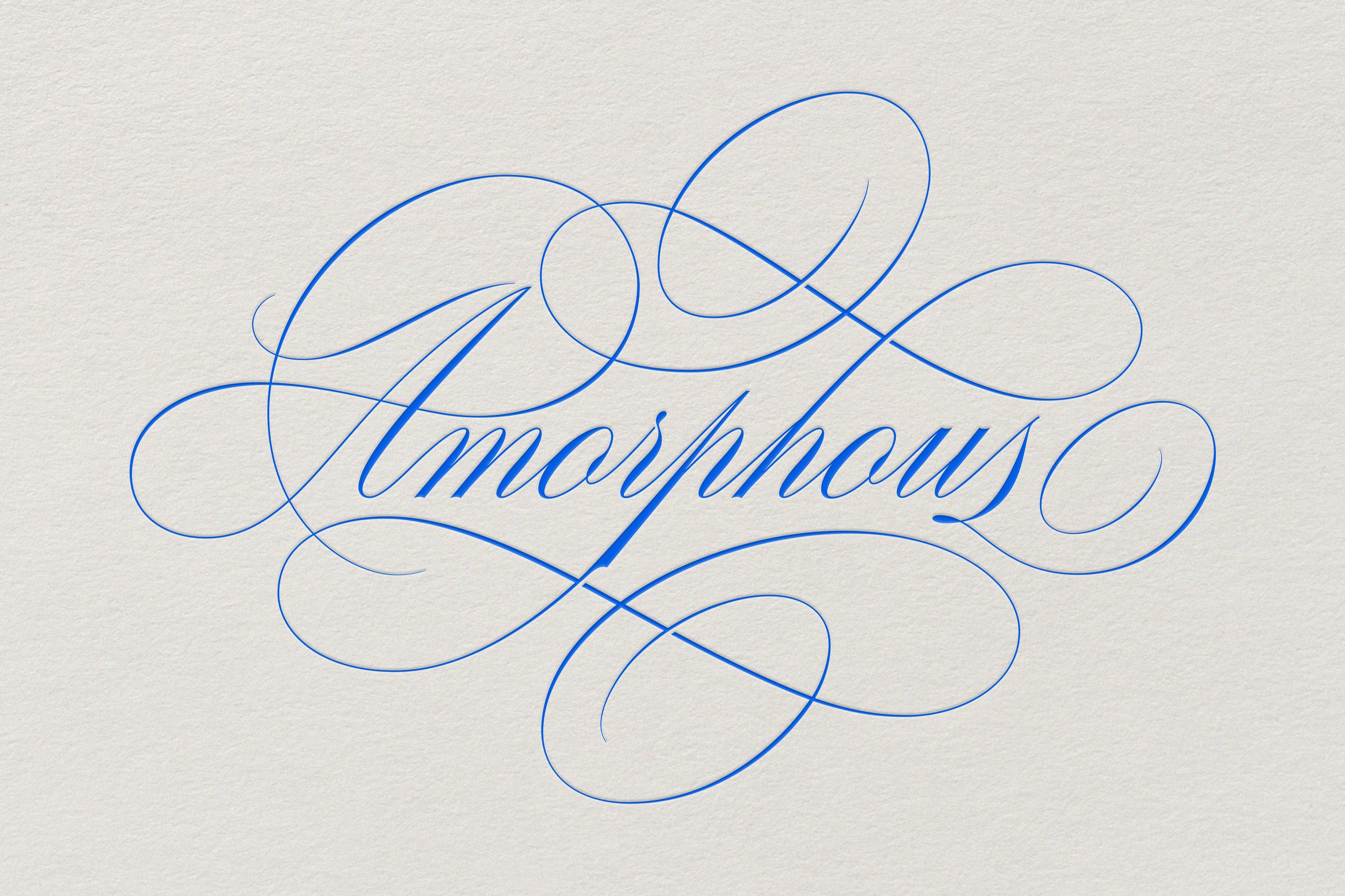
Amorphous
/əˈmôrfəs/
Without a clearly defined shape or form.
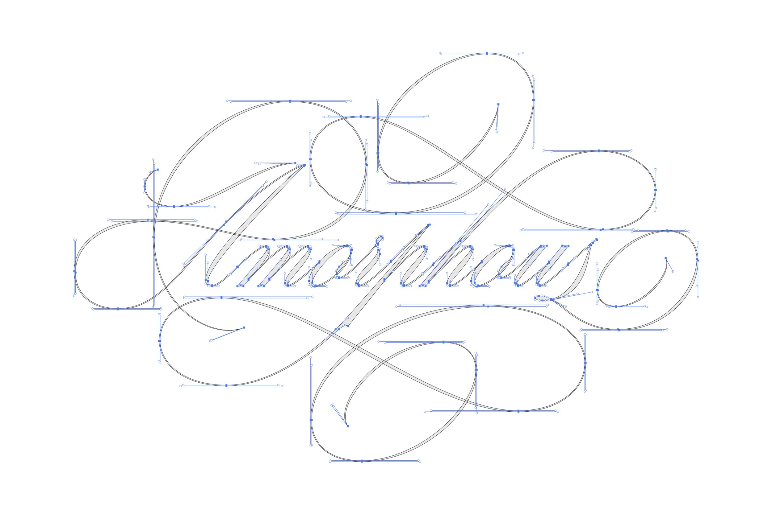
The design is based off of an Italian script called Scrittura Inglese taken from the Società Augusta Foundry (later renamed to Nebiolo & Co) based in Turin. I used this as a reference to develop a hand-lettered script with its own signature touch.
Part of my design process involves exploring unconventional ways to visually articulate ideas. I find the contradiction between the meaning of the word “amorphous” and the style choice quite amusing.

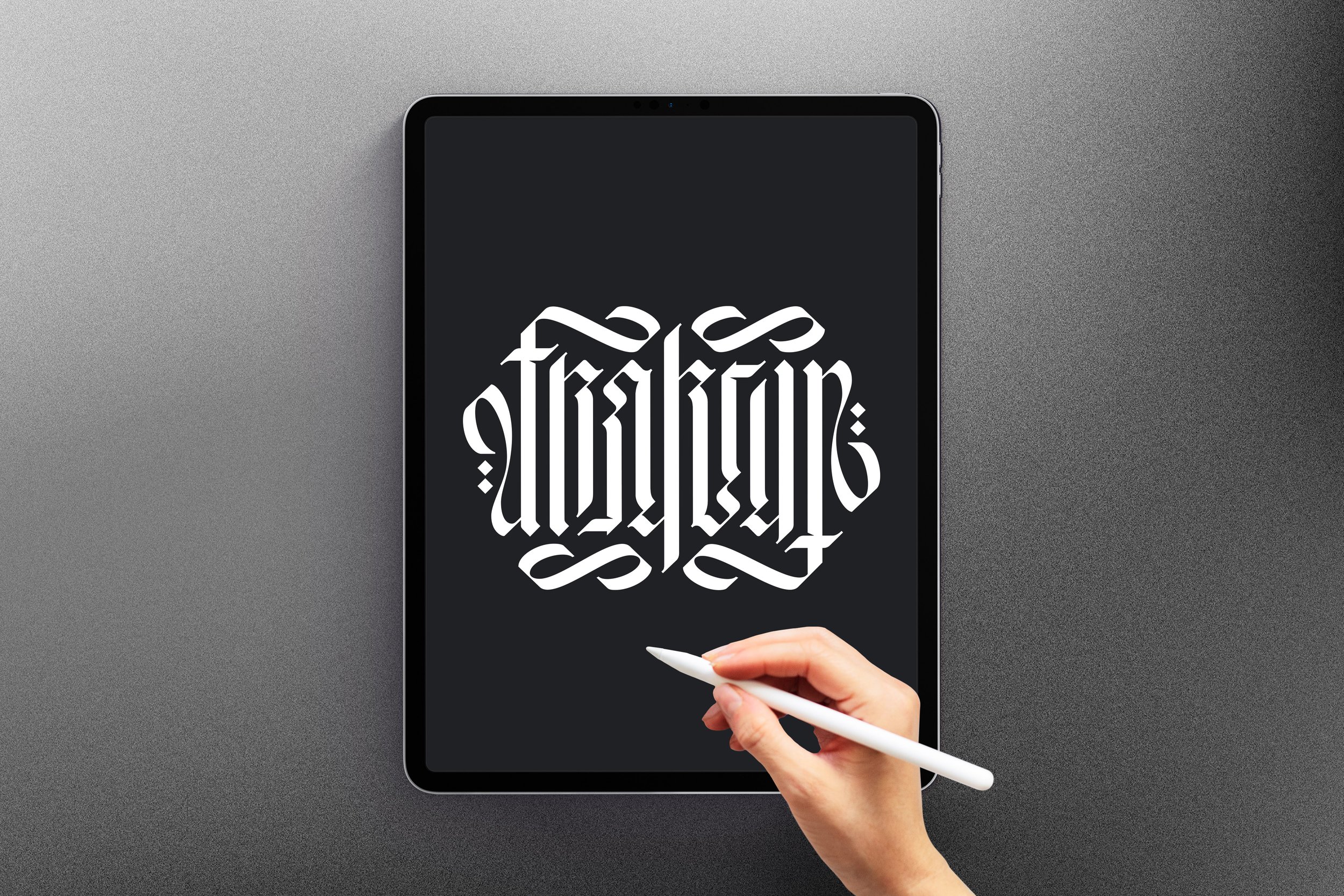
Fraktur
“Fraktur” is an ambigram honouring the common German blackletter that spread across Eastern Europe in the early 16th century. I had spent time studying various styles, even developing practice sheets to better understand its letterforms and key characteristics.
This practice allowed me to explore a more curated design where I was able to incorporate more playful and abstract elements.


Kirmizi
“Kirmizi” is a monogram inspired by Turkish musical artist Tuğkan. I always wanted to design in a different language and his song “Kırmızı” became the perfect opportunity. It has a beautiful and haunting melody that ebbs and flows like a soft stream that lulls you to sleep.
Given the nature of the ballad, I could have created something a bit more visually organic. However, my exploration led me down a different path. Going against the grain can sometimes lead to unique, if not superior, results.

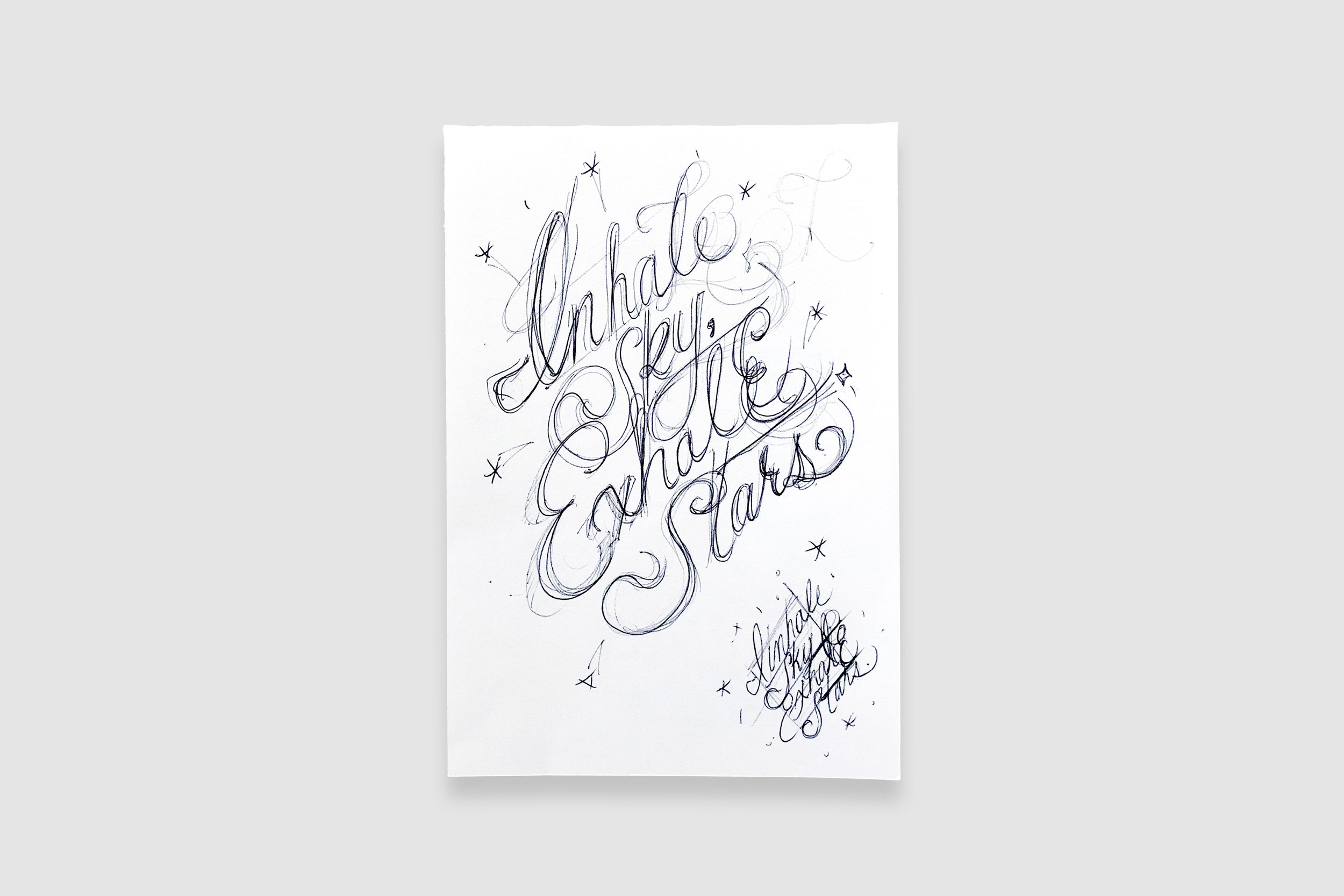
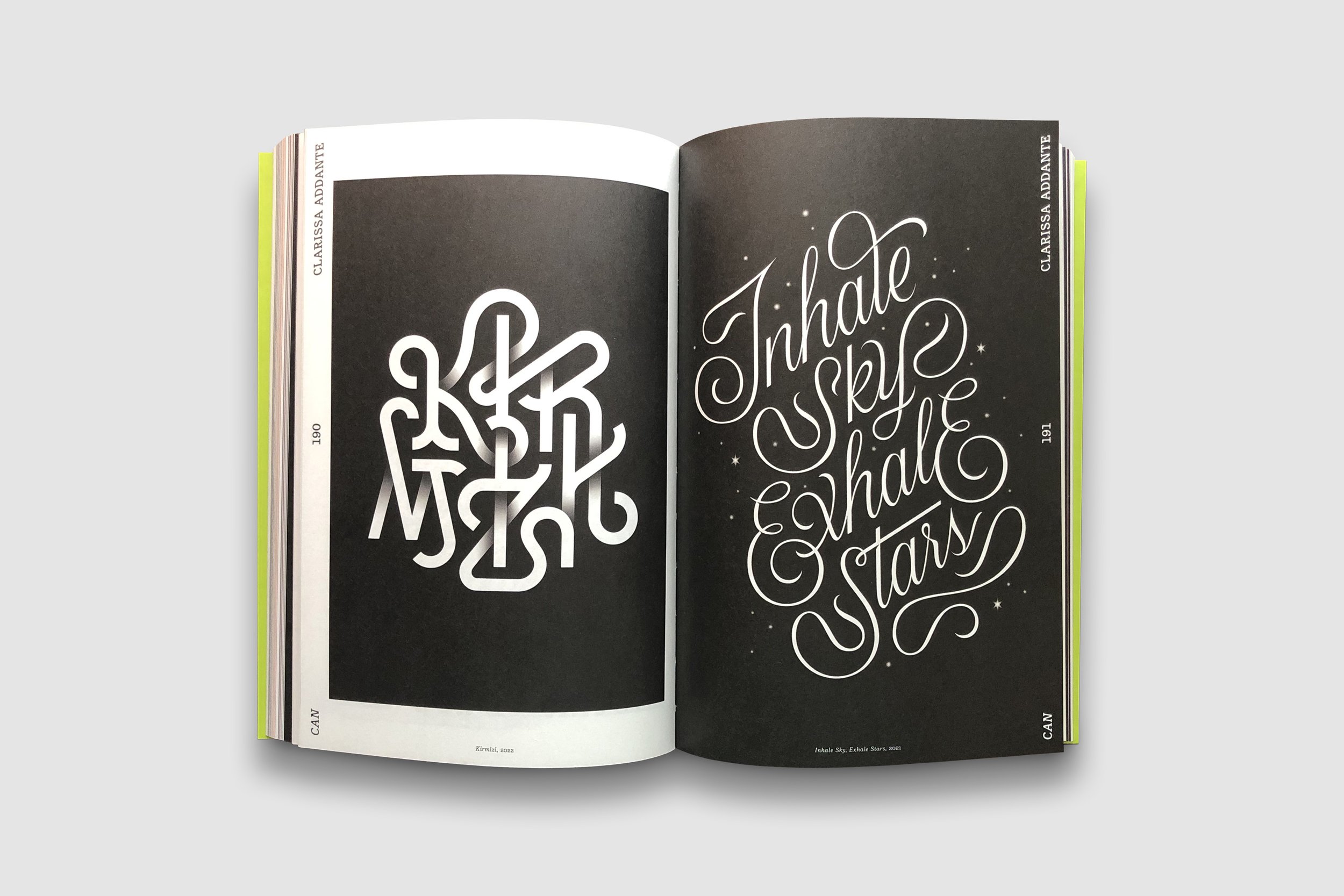
Inhale Sky, Exhale Stars
I decided to contribute to a small Australian publication called Typism during the difficult year of 2020. This choice was aimed at reviving my creative block. “Inhale sky, Exhale stars” originated from a place of haphazard experimentation. I allowed my intuition to guide me where I needed to go and trusted the process.
The design paid off as the artwork was selected for print the following year for Typism Book 7. It also made an appearance along with “Kirmizi” in the first edition of The Yearbook of Lettering by Slanted Publishers.
